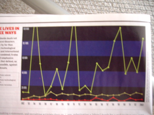
The top green line is world wide deaths from natural disasters. The middle brown line is world wide deaths from technological disasters. The red bottom line is world wide deaths from terrorism. The x axis is by year from 1982 to 2003 and the y axis goes from 0 to 100,000. I realize the picture is fairly fuzzy but I think it still gets the point across and makes me feel less bad about infringing on their copyright. I would say more about it but I think it makes its points on its own.
Yes, the first picture I posted on my blog is a graph, oh well.
No comments:
Post a Comment